purpose-driven event.
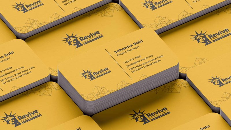
Revive Conference is a purpose-driven event built around inspiration, growth, and renewal. They needed a visual identity that could carry across stage screens, printed programs, social posts, and on-site signage — without losing its energy or feeling thrown together. Every touchpoint had to feel intentional.
We developed the visual identity and creative direction — building a flexible system that holds together across formats, scales, and contexts. The result is an event identity that feels recognizable, energetic, and aligned with the gathering's purpose, no matter where attendees encounter it.


Conference branding has to work at every distance — readable from the back row of an auditorium, recognizable as a thumbnail on social. We designed for that range from the first sketch.
The system isn't just a logo — it's a language: colors, typography, motion principles, photographic style. Every team member working on the event speaks the same visual language without coordination.
Event branding is one of the few briefs that demands flawless print and flawless digital in the same week. We delivered both, ready to go from press check to live stream.
“Testimonial coming soon — we'll add the client's words shortly.”

